Twitter becomes X.com and says goodbye to the blue bird. The new logo chosen by Elon Musk actually comes from a font found online.
Elon Musk likes to go fast without bothering with details like intellectual property. When the billionaire announces on Twitter that he is looking for an “X” logo to replace the Twitter bird for a change in less than 24 hours, this leaves little room for verifications of use by the legal services.
The chosen logo was proposed by Sawyer Merritt, who describes himself as a podcaster and Tesla investor. Except that here, the proposed logo is actually a barely modified version of the letter X in the Special Alphabets 4 font put online by Monotype.
A simple font becomes the logo of a major social network
It was user Mike Blackney (@kurtruslfanclub) who shed light on the origin of the new logo for X, the new name for Twitter.
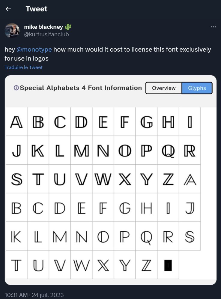
“The authorof the new Twitter logo also confirmed this by sending of a message : “@ajtourville designed the thicker X logo below for our (now discontinued) X Pod podcast. The thicker logo was inspired by a font he found online (bottom right). I created the video using the police logo, adding a glow and small lines in the logo to make it look “imperfect“”.
To arrive at the logo proposed to Elon Musk, the two men therefore very slightly modified the thickness of the line of the letter X from a font found on the Internet. And it is this logo that is now the official logo of one of the main social networks in the world.
To follow us, we invite you to download our Android and iOS application. You can read our articles, files, and watch our latest YouTube videos.