60-30-10 rule
How to add color to your home with this interior hack
© Vusal / Adobe Stock
Colors are one of the most important tools for making our home comfortable. But how do you best use different tones? The 60-30-10 rule is the perfect interior hack for color distribution in your home.
Do you really want to add color to your four walls, but don’t really know how to do it? Maybe walls in an intense color are too much for you, but a few pillows seem like too little. And you may also be unsure which tones harmonize with each other and what you should pay attention to when choosing. The 60-30-10 rule could be your interior salvation!
What exactly is the 60-30-10 rule?
Living experts have developed this rule to describe the optimal color distribution in a room or apartment. The basic principle: You need three different colors that work well together to create a harmonious image in a room. It doesn’t matter whether it’s the living room, bedroom, kitchen or a completely different room.
60 percent: The main color
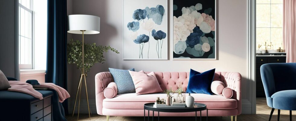
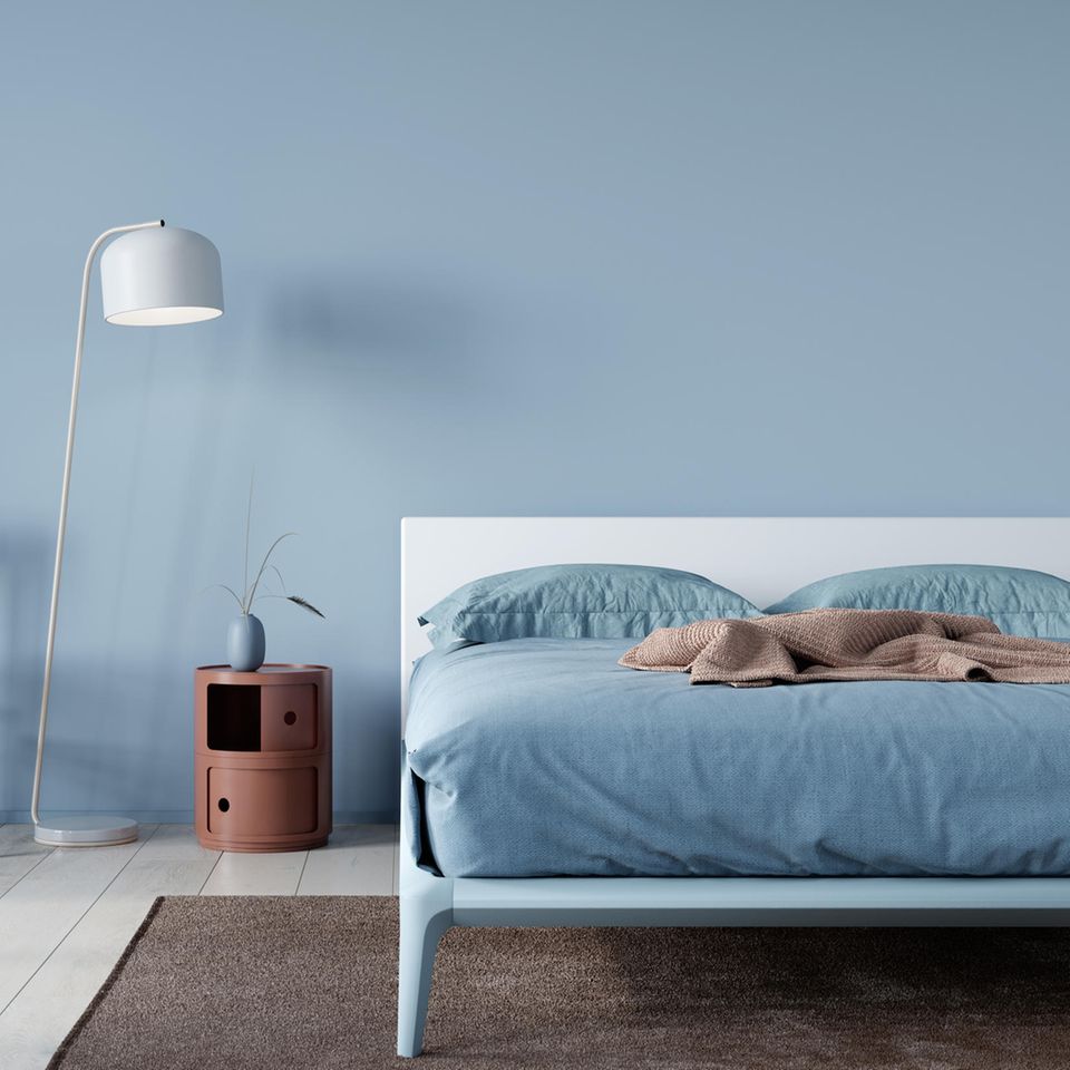
First, you decide on a main color that you would like to use in your living room, for example. She defines them Basic mood in the room and should be represented at around 60 percent. Depending on your taste, this can be a more neutral color, such as gray or beige. But more intense tones, such as dark blue or bottle green, can also be suitable. For example, you can paint the walls in this color – or perhaps just an accent wall if the colors are stronger. You can also use this main color as a guide for larger pieces of furniture such as a sofa or a carpet.
30 percent: The secondary color
Now comes the secondary color, which makes up about 30 percent of the colored objects in your room. This means that it is present, but significantly less than the main color. she should harmonize with the main color and, in the best case, balance it – therefore it should be in the same color family. If you’re working with about 60 percent light gray, your secondary color could perhaps be anthracite. If your main color is an intense shade of green, perhaps a lighter shade of green or cream could act as a secondary color that will bring out the bolder shade well while harmonizing.
Curtains or carpets are suitable for the secondary color, perhaps even an armchair. For example, if you painted an accent wall in your primary color, the secondary color could decorate the rest of the walls.
10 percent: The accent color
You can now highlight the remaining ten percent of your room with an accent color. This accent tone can be a little brighter, especially if your main and secondary colors are rather subtle. Depending on your taste, you could complement the various gray or beige tones that make up 90 percent of your color scheme with a strong pink or blue, for example.
The accent color is best used in decoration, for example in cushions on the sofa, small blankets, vases or pictures. The advantage is that you can occasionally vary your accent color by swapping out these small items with little effort. For example, you may want to work with a bright accent color in the summer, but prefer a warmer tone in the winter.
Tips and tricks: How to use the 60-30-10 rule
- If you start designing one or more rooms using the 60-30-10 principle, you should start with the main color. Think about which tone you like best, whether you are more comfortable with subtle, light tones in Scandi style or whether you prefer intense, dark tones.
- Then see which two tones are suitable as secondary and accent colors. The three tones should harmonize well with each other and radiate the right level of calm or intensity for you.
- The 60-30-10 rule doesn’t have to be exactly set in stone. If you’re braver when it comes to interior design, feel free to experiment a bit. One possibility is to add a second accent color – and thus turn the principle into the “110 percent rule”. Ultimately, no one knows better than you how you feel most comfortable in your home.
Sources used: myhomebook.de, sigmacoatings.de

