Deezer presents a new visual appearance which should allow the service to differentiate itself from Spotify and Apple Music.
In this year 2023, Deezer is changing its economic model, by increasing prices, like its competitors Apple Music and Spotify, but also by revolutionizing the remuneration model for artists, for a fairer distribution of copyright. This upheaval would not be complete without the change of image that goes with it. After 16 years of existence, Deezer “reinvents itself” with a new visual identity more in line with the “true personality” of the company.

With 5 million “only” paying subscribers, Deezer, the Made in France music streaming service, still has a long way to go before it can claim the same number of customers as the market leader, Spotify, with nearly 410 million users. Although it appears as an outsider in the face of well-established giants, Deezer nevertheless continues to mark its difference.
Deezer marks its difference with Spotify by adopting a new logo and a new look
In terms of functionality to start with, with a rich catalog of 120 million titlesand exclusive features such as the ability to transfer playlists from a competing servicea CD quality streaming offer, the possibility ofupload your personal discotheque to the cloude, and many others. That said, it is in terms of image and “personality” that the company wants to stand out. Through this formal rebranding, it wants to reveal a signature that sums up its new energy: Live the Music.
To read – Music streaming service comparison: Spotify, Deezer, YouTube Music, Amazon Music, which is the best?
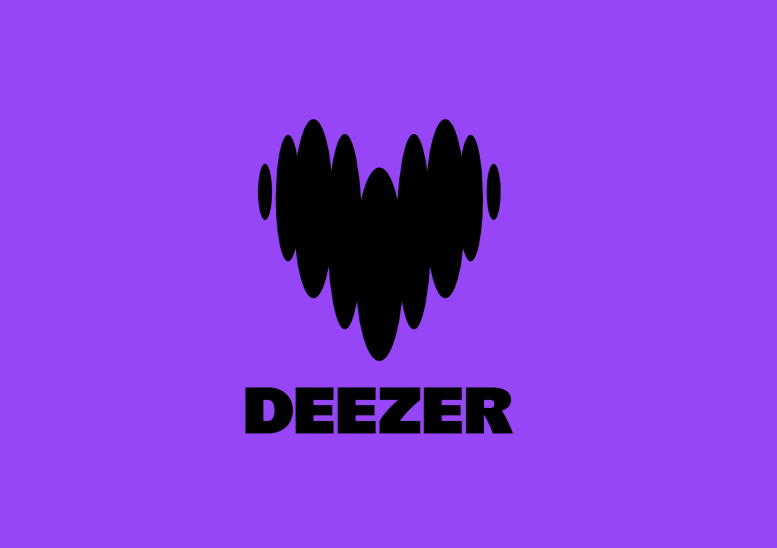
Upcoming skins and user interfaces will reflect a new identity, as expressed in the choice of purple as the main shade, which embodies extravagance and creativity as much as independence and passion. There color palette selected by Deezer in 2023 aims to be avant-garde, curler and quirky. The logo created by Koto Studio is a good example of this new identity. Goodbye to the colored columns evoking a hi-fi equalizer, and welcome to the heart that beats to the rhythm of the music.