Two new buttons have been added to Google Maps: Fires and Air Quality. Unfortunately, they are current.
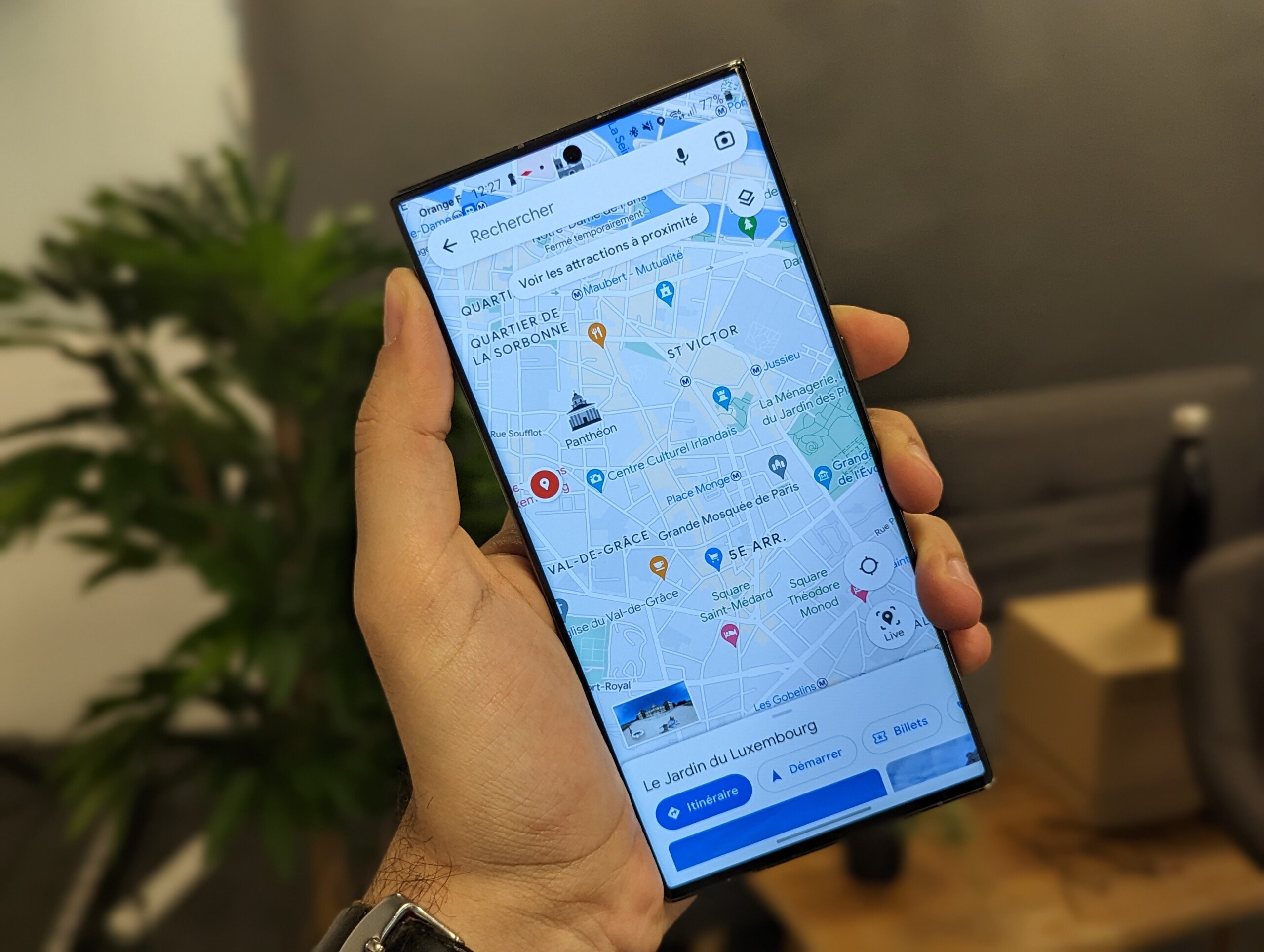
If you use Google Maps, you might see that the app got two new buttons. To discover them, you must first click on the icon taking the form of two superimposed layers, on the right of the screen. This key is used to modify the appearance of the map, but also to highlight certain information concerning public transport, cycle paths, roads or even certain buildings. However, it is precisely in this list that the two new options slip: Fires And Air quality.
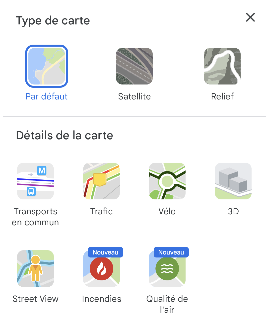
We already knew that Google Maps was working on wildfire tracking as well as air quality analysis. However, with the arrival of the two new buttons, this work becomes a little more concrete.
Fires and Air Quality on Google Maps
The names of these functions are quite explicit: the first is used to display the places where fires are taking place in order to follow their evolution, the second allows you to find out about the level of pollution in the air in a particular area. In other words, Google Maps offers two options that we would never like to need, but which are unfortunately relevant. Climate change favors the outbreak of large fires while the very degraded air quality in certain regions of the world has an impact on the health of populations.
If you click on the Fires button, you will see red dots appear on the map. Each of them corresponds to a fire of magnitude. By tapping on one of the dots, you will be able to obtain information on the current crisis and Maps lists links to its official sources. For some fires, the application also displays some press articles.


Also, if you fly over North America, you will see that the red dots listed are surrounded by a red box showing the approximate extent of exposed territories. We haven’t seen this in other regions of the world map yet.


For the Air quality function, the principle is the same. Once you have opted for this view, you will see colored dots ranging from green to purple depending on the level of ambient pollution in the area you are interested in. Note, however, that at the time of this writing, we have access to this data in only a handful of countries: United States, Mexico, Brazil, Chile, Israel, India, South Korea and Australia.


Finally, whether it’s fires or air quality, as soon as you click on a point, you can tap on an information button which will take you to an explanatory page where the Google Maps teams explain their methodologies and provide some details on how these options work.
We have seen the arrival of these two new buttons on version 11.94.0303 of Google Maps with an account registered in the beta program.
Want to join a community of enthusiasts? Our Discord welcomes you, it’s a place of mutual aid and passion around tech.