
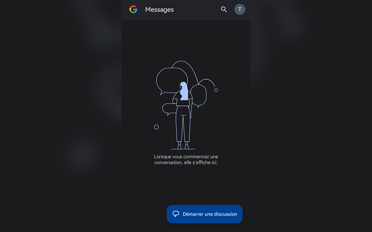
Google is rolling out a graphical overhaul of its Messages application. The new design changes the way you use the app, but not necessarily for the better. Here’s what’s changing.

If you opened the app Google Posts recently and you raised an eyebrow and thought something had changed, that’s normal. The messaging service has in fact offered itself a new look. First tested in beta during the summer, it is starting to be deployed to users. First observation, it is different from the design seen on the Samsung Galaxy earlier in the month. Second observation, you will have to change your habits, navigation in the application is no longer the same.
The first thing that strikes you is the disappearance of the hamburger menu on the top corner left. These 3 parallel lines which allowed access to options such as favorite, archived or blocked messages. Instead, the Google logo. No need to press it, nothing will happen. The change seems trivial, but it is far from intuitive as we are used to using the menu in many applications, including those from Google. From now on, almost all the functions are revealed in touching your account icon top right.
Read also – Google Messages: your conversations will soon be accessible on multiple devices, like WhatsApp
Google’s new design of the Messages app makes it less convenient
As we can see in the screenshot below, this is where we find what was in the hamburger menu: Archived messages, Spam and blocked conversations, Mark all as read And Pair a device. Note one absent: the choice of theme of the application (light or dark). This option is relegated to the Messages app settingstowards the middle of the page.
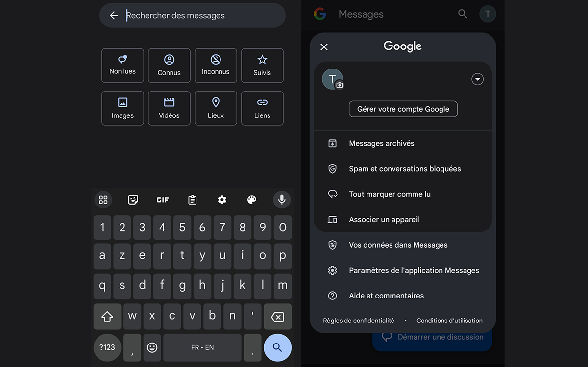
Finally, the search bar also disappears. You must press themagnifying glass icon at the top right to open a series of filters in grid form. This is more practical than the old version since it requires less scrolling. It will take a little time to get used to this new design, especially since it lacks pedagogy. For example, Google could have added a tooltip when opened to indicate that the options were now stored under the account icon.