

From time to time, Google undertakes new design experiments, but these often remain within limits. A new test, on the other hand, makes the search look quite different. The navigation bar moves to the left side. In this way, the search options are displayed more prominently.
Google tests new navigation bar
Some Google users have noticed a design test that is currently being carried out. While everything stays the same on mobile, there’s a visible difference on desktop. The navigation bar, which was previously always located above the search results, moves to the left and stands next to the results.
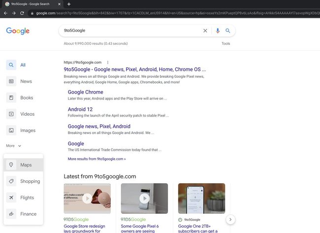
The search options such as images, videos and maps are given a new look a completely different weight and are more prominently available. As always, the arrangement of the options is at least partly dependent on the context. Depending on the search term, certain options are higher up. If you’re looking for a “restaurant,” you might want to look on Google Maps rather than watch a video.
The test has additional effects on the display of the number of results and the speed of the search. Data on this is now placed directly under the search slot and do not migrate to the left side (source: 9to5Google).
Gmail is also working on the design:
Google’s new navigation: More than just a small test?
Google is currently only showing the new navigation to a few users. Whether this is perhaps more than just a test, the future will show. Google will Evaluate user reactions precisely and then make a decision.
It is already clear that the unfamiliar look definitely has advantages. The larger icons and buttons make the options easier to click and tap. However, the new arrangement is unlikely to be used on mobile phones due to the smaller screen.