
We’ll soon be able to get our first glimpse of iOS 16, as summer isn’t too far away and Apple will be unveiling the next iPhone update at WWDC. An idea worth seeing already shows how the previously familiar operation could be completely turned upside down.
Since autumn last year, iOS 15 can be installed on the iPhone, really tangible However, there is no information about iOS 16 yet in the rumor mill. After all, Apple will definitely show the upcoming update in June at the in-house developer fair. Of course: speculating and “spinning around” is allowed.
Concept for iOS 16: Awesome operation of the iPhone
This is what Italian designer Andrea Copellino does with his something crazy idea for iOS 16. Especially the home screen, the control center and the multitasking have done it. If Apple takes the design as an example, then we will have to rethink how it is used (source: Behance, Andrea Copellino).
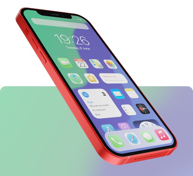
The first look goes to the home screen. Apparently inspired by Android at first, because a central clock widget and a search bar dominate the upper area. But the real revolution is underneath. Instead of swiping horizontally through different pages as usual, you simply scroll vertically and felt “endlessly” through the apps. Meanwhile, the dock hovers over the app icons. Looks crazy, but what would be the advantage?
Copellino writes:
“This new home screen is a vertical list. The layout improves usability as the icons are accessible from a lower, more accessible part of the screen surface.”
The designer could be right about that, because a Reaching into the upper part of the display is no longer necessary with one-handed operation. Last but not least, users of an iPhone Pro Max would appreciate this.
Multitasking and control center are now one unit
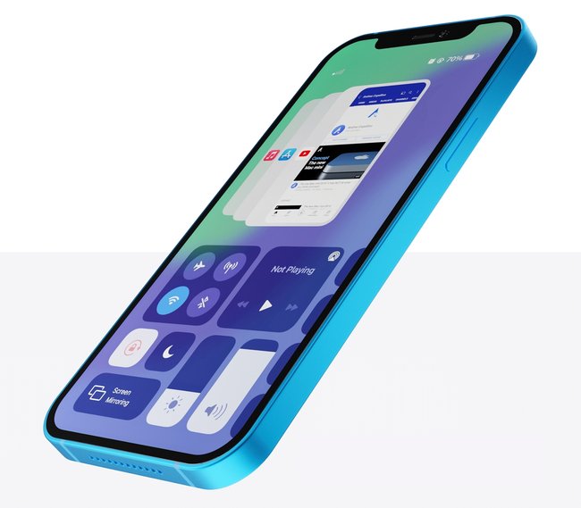
An exciting idea is also evident in multitasking. In the view, we not only see the app cards we are already familiar with, but also the control center. The latter occupies the lower part of the screen and can be scrolled through horizontally. In this way, all elements can be easily reached with one hand, finger dislocations are a thing of the past. The smaller app cards are also still easy to reach. They are now concentrating more on the apps or the associated icon itself, the content of the cards is rather irrelevant.
With the current iOS 15, Apple is giving us this cool function, explains in Video:
In order to the multitasking interface approaches the fast and efficient application switching on the Mac, accessed via Command + Tab. We usually know which app we want to switch to. The detailed view of the maps or app content is negligible.