
Perhaps you have already noticed this following the latest update of WhatsApp on Android: the navigation bar has changed position and its content has been slightly revised. For the best or for the worst ? Users (including us…) have an opinion on the matter.
A few days ago, WhatsApp received a traditional update on Android devices. Generally, the changes made are quite discreet. Lately, we can for example note the possibility of pinning up to three messages or a richer text formatting system. So, the change in question here is obvious: the navigation bar, until now displayed at the top of the interface within the home page, has been moved to the very bottom. Its content has also evolved. WhatsApp’s objective is to offer simpler access to its tools, directly with the thumb, while improving the overall visual appearance.
WhatsApp better highlights its tools
Concretely, as perfectly illustrated in the before / after below, the menu goes from three to four entries, while the illustration of characters on the left bows out. Conversely, each entry gains an icon to clarify its function.
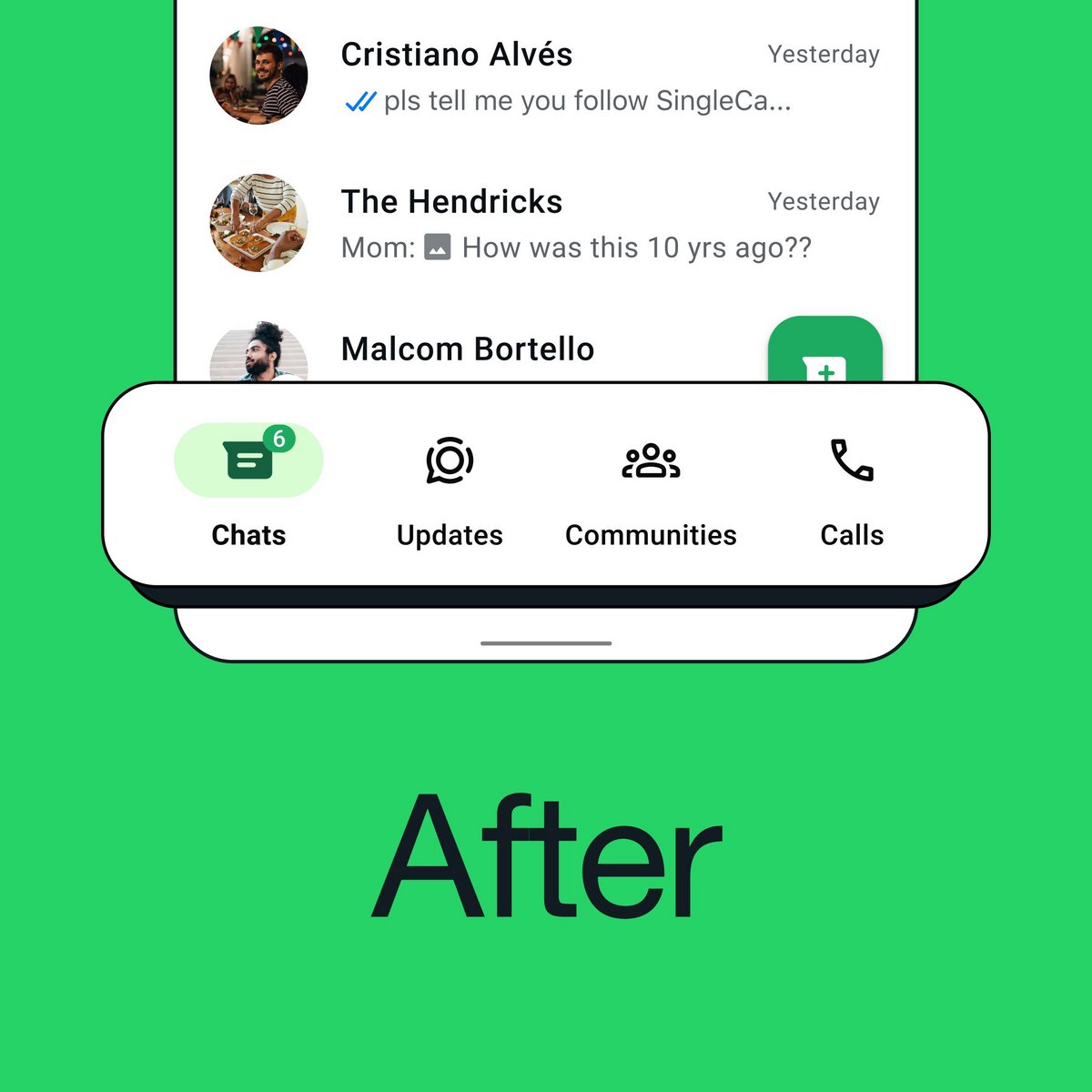
The “Discussions” entry on the far left does not change. Then, “Status” is replaced by “News”, where the user’s status is located as well as the channels (to receive news on certain subjects by following accounts, like Clubic, at random). Third, “Communities” (which allow you to create thematic discussion groups) now have a dedicated entry at the reception, while “Calls” still have a dedicated menu in fourth place, on the far right.
A change that hardly pleases
With this change, WhatsApp undoubtedly wants to encourage its Android users to use its community tools more by highlighting them better. This new location is also no coincidence, since everything is more easily accessible (by mistake) with a flick of the thumb with your smartphone.
On X.com, many people don’t seem happy about the change. Some complain about the place taken by community functions that they do not use, within an application that is ever more cumbersome and far from the simplicity of the beginnings. Others, however, welcome a long-awaited redesign, which notably makes it possible to catch up with the iOS version. Like any major interface change, a little time to adapt will be required: nothing terrible, ultimately!
Source : WhatsApp
0