
A few days after the deployment of the new version of Garmin Connect, users deplore this new interface, pushing Garmin to communicate.
It is now deployed. Several months after the announcement of the graphic redesign of Garmin Connect in beta, the companion application for the American manufacturer’s watches, the firm finally announced with great fanfare, this Monday, the deployment of this new interface.
The least we can say is that this update is not to everyone’s tastes. Since the start of the deployment to all users, the rumble has been particularly felt, whether on X (formerly Twitter) or on the various subreddits related to Garmin products. This is particularly the case of Mick Craig on X who deplores the new graphics: “The new Garmin Connect interface is horrible. They took something that worked great and broke it. Why change just for the sake of change?»
On Reddit, the uproar is even greater and comments have been multiplying in recent days to deplore this new interface. This is particularly the case of a user who finds it “horrible”:
Having to scroll down to see the same amount of information that was previously on the display is horrible. I love my Garmin watch and loved the app until the last update.
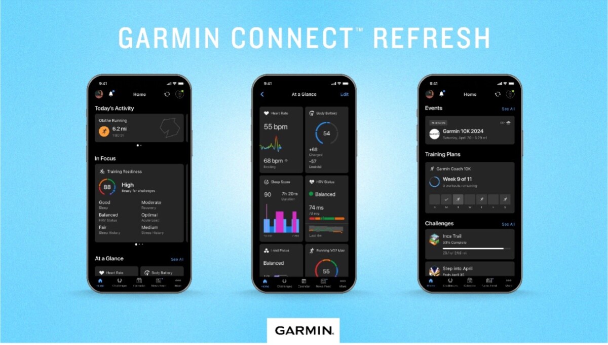
As a reminder, the Garmin Connect update will highlight certain information more for the user based on their own criteria, with a “focus“. This topic requires users to swipe left or right to access certain data. This may be the case for sleep data for people who place an important emphasis on recovery, or activity data for those focusing above all on performance.
Garmin encourages its users to respond
In addition, the redesign of Garmin Connect also changes the way in which the various data is displayed on the home screen. Whereas they were displayed in successive lines previously, they are now displayed in taller tiles. The screen will also display two columns of different tiles.
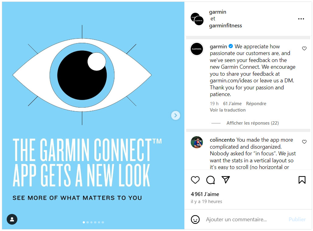
Faced with discontent, Garmin ended up speaking out in a publication promoting this new interface on Instagram. In a comment, the American manufacturer indicates: “We appreciate our customers’ passion and have seen the feedback to the new version of Garmin Connect. We encourage you to share your feedback at garmin.com/ideas or send us a private message. Thank you for your passion and patience“.
Enough to suggest that the firm has heard the criticism and that it is ready to correct the various points noted by users of its application. However, it is still unclear when these fixes will be effective.