Apple has explored many avenues to replace the iPhone notch with the Dynamic Island, introduced with theiPhone 14 Pro in 2022. Several pieces of information today give us an overview of the work paths taken by the designers of the American brand.
The iPhone notch appeared with the iPhone was then declined on later models. iPhone users, and fans of the brand, have not been kind to this notch, considered at best unsightly and unrepresentative of the care taken by Apple in the design. However, the manufacturer’s designers worked to transform the notch to give it more utility.
A notch that has been debated since its appearance with the iPhone
In 2022, the iPhone 14 Pro that we tested at Clubic introduced the Dynamic Island, a new smaller notch, but also interactive. Apple’s idea with this new area is to display contextual information when using an application.
Playing a piece of music displays the album art. The timer also displays in this area, along with your favorite team’s score, or the time remaining to receive your Uber Eats order. The Dynamic Island expands on the screen to show more elements, using rather elegant animations that are unique to each application.
With the Dynamic Island, Apple has finally succeeded in turning a hardware constraint into a functionality, and a marketing argument against its many competitors in the smartphone market. However, the ideas launched by the design teams were very far from the product we know today. Our colleagues from MacRumors recovered some information on the concepts considered, then abandoned.
Before the Dynamic Island, several more or less relevant concepts
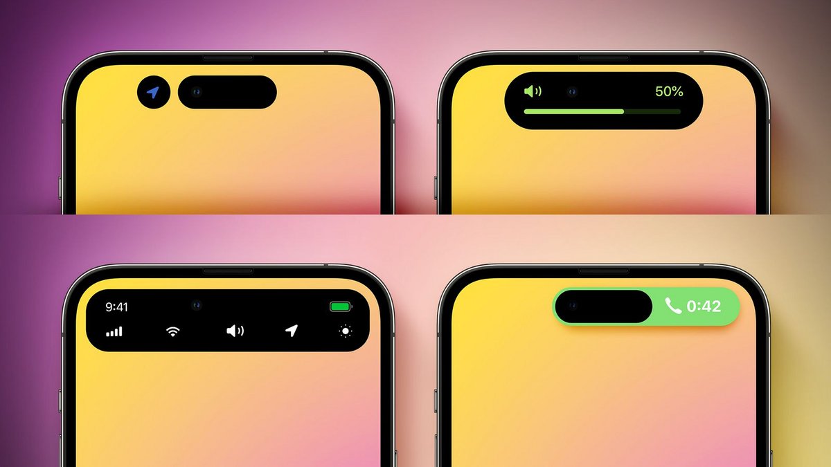
Apple’s first idea was to add a second notch on the right side of the screen. The latter would have integrated different information such as the battery level, the type of mobile or Wi-Fi network or even the time, and which is now displayed at the top of the iPhone screen. This menu was displayed on demand, and disappeared after a few seconds, in order to free up space at the top of the screen.
The second concept was to replace the notch with a completely black, fixed area at the top of the screen. The notch would have been included to display information, but had the disadvantage of losing display surface area.
Apple finally turned around the concept of the Dynamic Island, but first considered making it fixed and thicker than we know it today. Fortunately, the designers preferred to animate the patch according to needs, rather than imposing a fixed size which eats up precious pixels.
The Dynamic Island seems to be favored by consumers and iPhone development teams, and is now present on the entire iPhone 15 range. We now hope that iOS 18, which will be presented next June, will invest a little no longer this area, quite practical on a daily basis, but used by too limited a number of applications, for example to display all iPhone notifications.
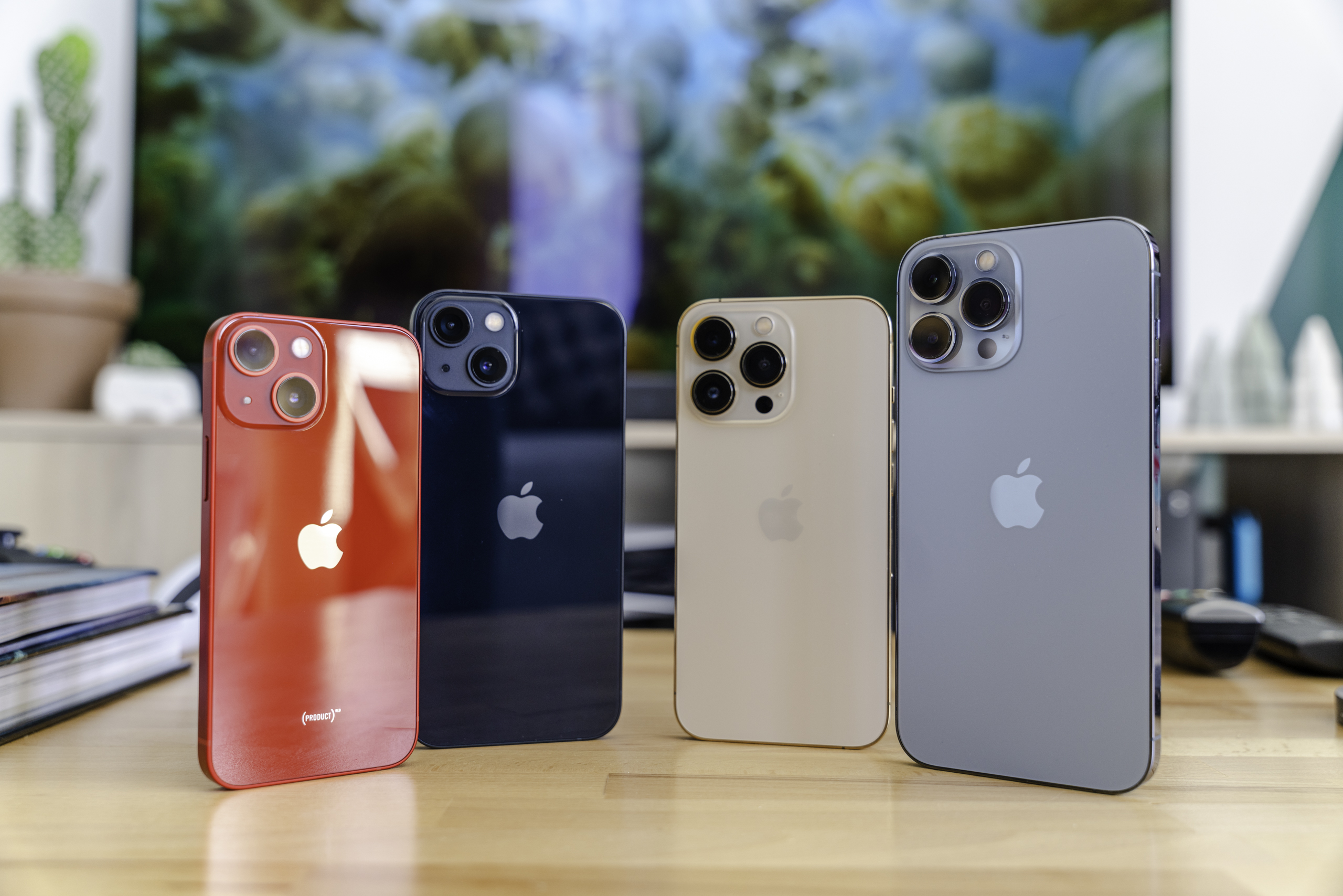
Set like a Swiss watch, Apple launched its new batch of iPhones at the start of the school year. The latest batch brought us the iPhone 15, iPhone 15 Plus, iPhone 15 Pro and iPhone 15 Pro Max.
Read more
Source : MacRumors

6