Pig claw? Anyway, you don’t need to do hand lettering! We explain why – and above all, how to do it!
What are calligraphy, lettering & hand lettering? The basics
calligraphy
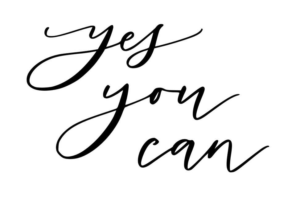
Calligraphy (also called calligraphy) is derived from the ancient Greek “kalos” for “beauty” and from the ancient Greek “graphein” for “writing” and describes the art of handwriting. It is usually done with pen and ink. This is in contrast to the typography, which describes the printed font (i.e. not by hand).
Lettering
The term lettering in general means the art of beautiful letters, the focus is on drawing letters as opposed to writing like calligraphy.
There are these types of lettering
Hand lettering
For hand lettering, different types of pens are suitable for drawing the letters.
Brushlettering
The English term “brush” means “brush” and so brushes or brush pens, so-called brush pens, are used in brushlettering.
Faux calligraphy
With “false calligraphy” you use a normal pen and create a calligraphy effect! You can do this in three simple steps.
Bounce lettering
From the English “to bounce” for bouncing, bouncing or bouncing, the name describes the effect bounce lettering has pretty well: The letters are not all in a straight line, but some appear as if they are out of line … ideally you use this stylistic device when you have a lot of space available. Challenge: stay horizontal. So that your letters or words and lettering do not go wrong, you can draw a center line as a guide.
Material for hand lettering & Co.
The right paper
Normal printer paper (80 grams) is sufficient for practicing and trying out. If you want to refine your technique, special paper for hand lettering or brush lettering is a good choice, because it has a smooth and closed surface (“coated paper”). Otherwise it could be that the colors bleed out, i.e. the ink runs unsightly, and that the leads fray. Also pay attention to the thickness of the paper, if the paper is too thin, the color could push through. Watercolor paper makes sense if you want to combine a watercolor motif with hand lettering, in which case you need a pen with a robust, i.e. hard tip!
The colorful world of pens
- Brush pens: The name shows it: You use Brush Pens for brush lettering. They have a flexible tip and are suitable for both thin and thick lines.
- Fineliner: You create fine lines with them and therefore they are suitable for different types of font and paper and also for faux calligraphy.
- Felt-tip pens: They are also suitable for hand lettering, but have a fixed tip with which straight lines and colored areas can be designed.
You should also keep this in mind with the pens
- Some colors are waterproof, others are washable.
- Water-based paint can e.g. B. can be used for watercolor effects.
- Pencils are ideal for sketching.
- The wider the tip, the bigger the font!
Time for a makeover! The most beautiful upcycling ideas
11 images
Fonts
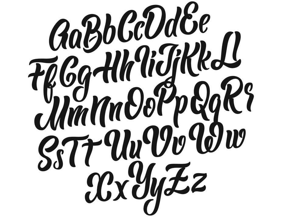
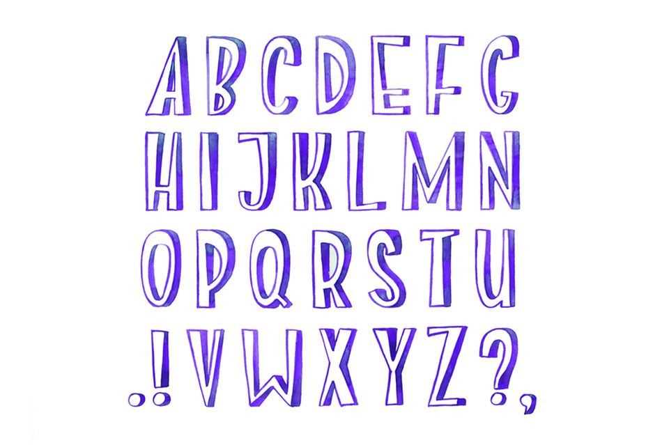
Countless fonts are waiting to form beautiful words and lettering. Thick, thin, fine, coarse, curved or straight block letters – the choice is overwhelming. Tip: Combining different types creates a particularly beautiful contrast. Here you will find a nice selection:

© memej / Shutterstock

© Paper Wings / Shutterstock

© Undrey / Shutterstock

© Senpo / Shutterstock
Ornaments Little effort, big effect: the Starburst skilfully stages font. © pa3x / Shutterstock
Ornaments are not a must. If it fits your motif, it can be further embellished in various ways with decorative elements. It can be:
- Points
- banner
- Arrows
- Stars
- Starburst
- Tendrils
- Flowers
- Everything that comes to mind!
Doodles (small drawings) are also good in some cases! Here we show you how to draw doodles.

Small drawings can enrich your hand lettering.
© Africa Studio / Shutterstock
Learn hand lettering – tips for beginners
It takes a lot of practice until you can shake the perfect letters out of your wrist! And you will quickly find out that they don’t have to be perfect at all. We’ll show you step by step how to get started.
How to start Very easy …
At the beginning you need the right material. Your starter set should contain:
To start with, it is useful to paint with a pen whose tip is not as flexible. Before you start painting, it is also useful to draw guidelines. You draw this with the pencil and the ruler. When you are done with your work, you can erase the lines.
Simple instructions for hand lettering
1. Practice up and down strokes
In the first step, it is advisable to practice the upstroke and the downstroke first and slowly but surely master both:
- smear: from top to bottom with (more) pressure
- spread: from bottom to top with little pressure
That might sound complicated at first, but it is basically very simple: If you draw an “A” you start with the first (left) side and gently guide the tip from bottom to top. If the “A” goes down on the other side, you put more pressure on the tip. This takes more practice with some letters and less practice with others. Orientate yourself on the desired font and hold the pen at about a 45-degree angle as you paint.
2. Practice the letters with guidelines
The letters are divided into different areas:
- Ascender
- Middle length
- Descender
You may know that from your primary school days … Examples: A small “a” fits in the middle length, a “p” in the lower and middle length or a “k” in the upper and middle length. The small “f” even includes all three areas. You can also practice hand lettering numbers this way.
Tip! The areas can be varied in size, for example a larger middle length and narrower ascenders and descenders create a completely different typeface than if they are all the same height.
3. Use stylistic devices
When you feel more confident, try different stylistic devices, such as:
- Set letters further apart
- The different lengths vary
- italicize
- Combine straight and italic letters
- Set loops, arches and curves
Exercise plan for you
- Practice the Up and down strokes and then go on to paint the little curve after the smear that you can use to connect the letters together later.
- Practice the letters of the alphabet, you’ve got the hang of it. Use the ascenders, middle and descenders to practice.
- It may be easier for you in the beginning big letters to draw. Others find it easier to practice with little ones. Find out what works better for you.
- After some training, you can Letters with a more flexible point try out.
- Try different Fonts and find your own style over time.
- To get a feel for certain fonts, you can also use a trick and trace the letters with tracing paper and practice them.
- If the letters sit so slowly, play along calmly different colors and other style elements and decorative elements.
- When you feel more secure, the only way to go is with the Baseline work and omit the upper and lower lengths. Or even draw completely freely …
What can you hand-type?
In short: everything you want! Classic areas of application are:
You can play with different colors, design color gradients, paint shadows, insert gold elements or combine your hand lettering with watercolor. You can find more inspiration in the Bullet Journal Ideas and learn more about watercolor painting here.
Would you like to exchange ideas with others about DIY techniques? Then take a look at ours BRIGITTE community past.
